Brand identity for Fontsmith
Brand identity and communications for Fontsmith, a UK based type foundry, set up by Jason Smith. A studio dedicated to designing bespoke corporate fonts and creating ‘FS’ branded fonts for independent release to the international design community. Now a part of the Monotype family.

Fontsmith's previous Identity
The FS monogram was created to provide a flexible framework, allowing all existing and future fonts to be integrated into the identity


Let the type do the talking
“Let the type do the talking” is the design philosophy that underpins all of Fontsmith’s communications. We developed this idea to ensure that the beauty, design and personality of each font in the library shines through, is celebrated and each font can tell its own story.


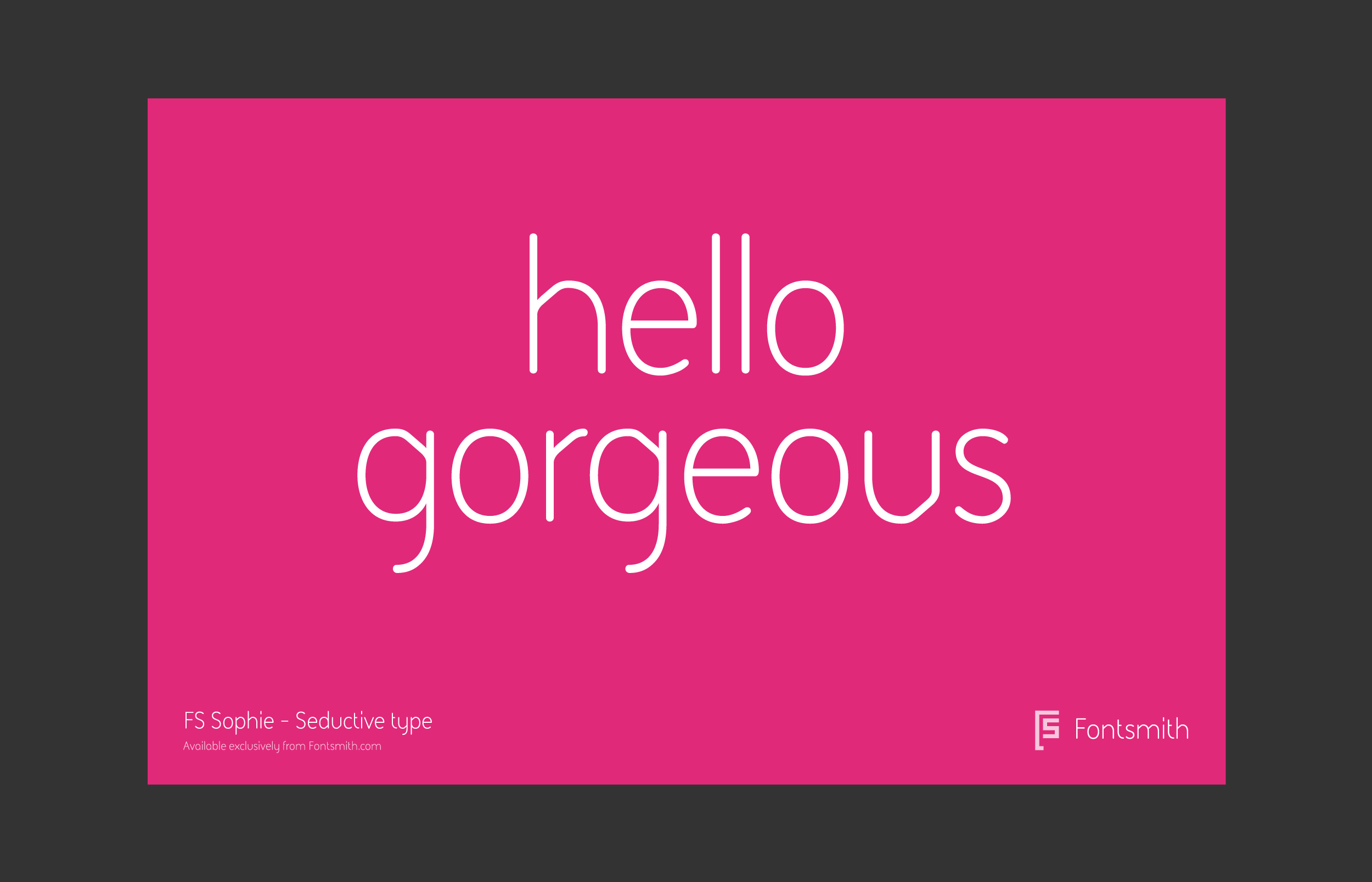
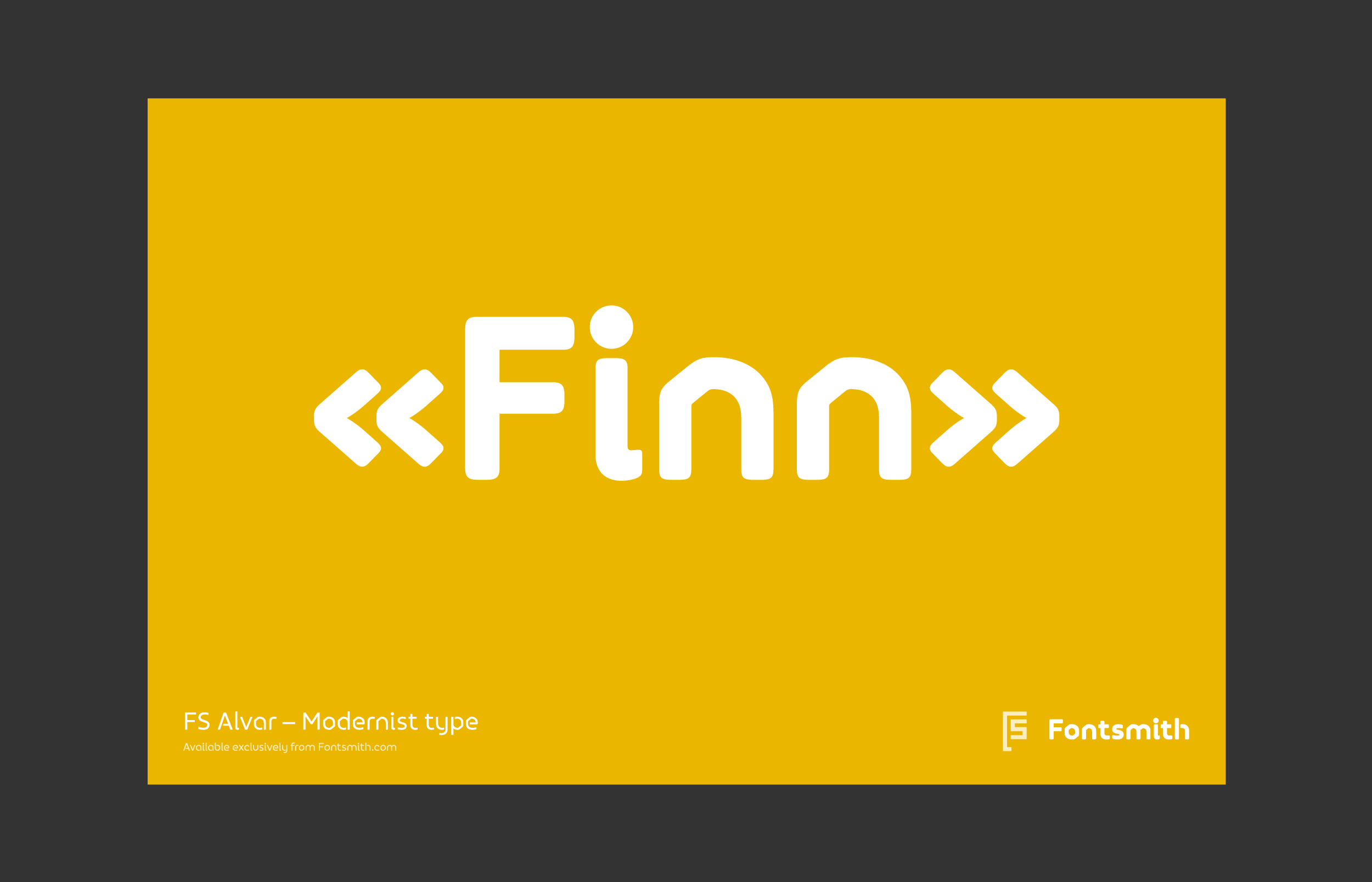
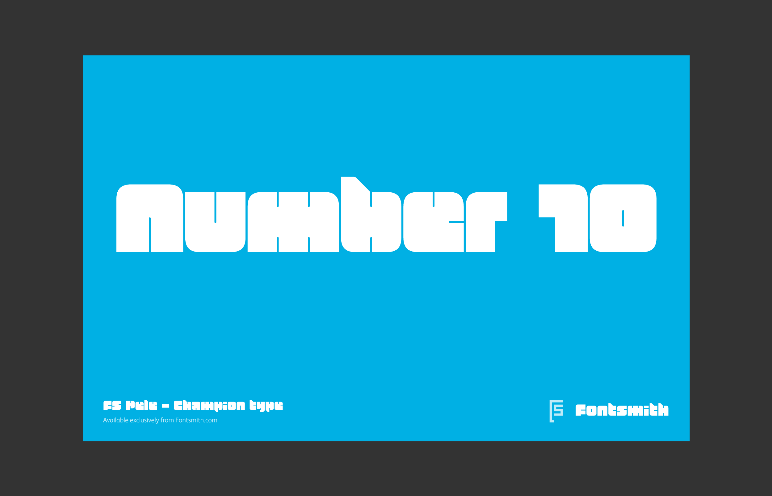
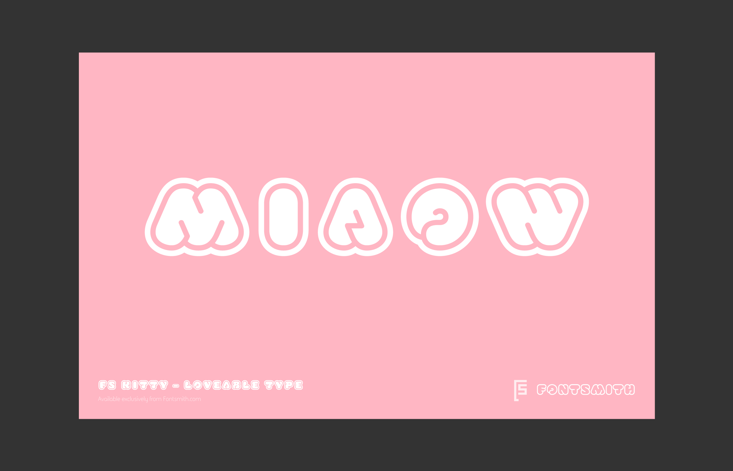
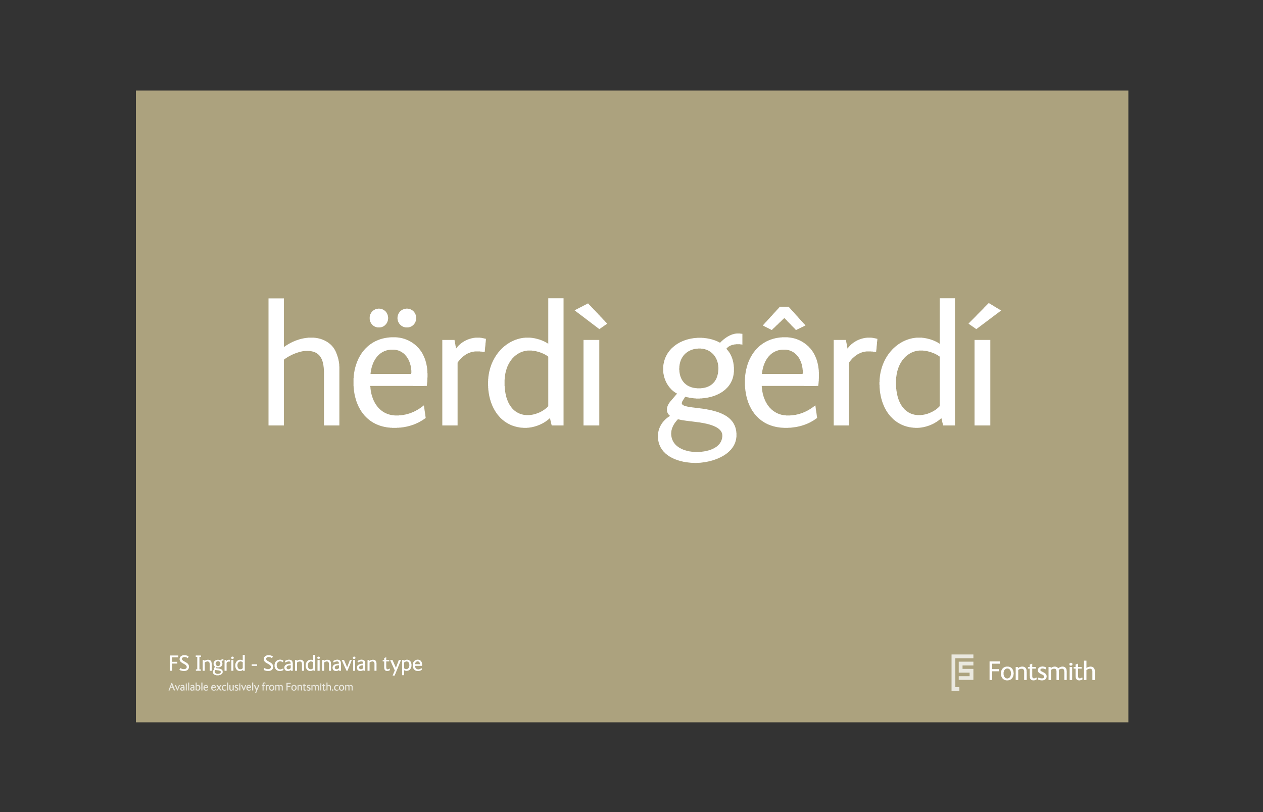
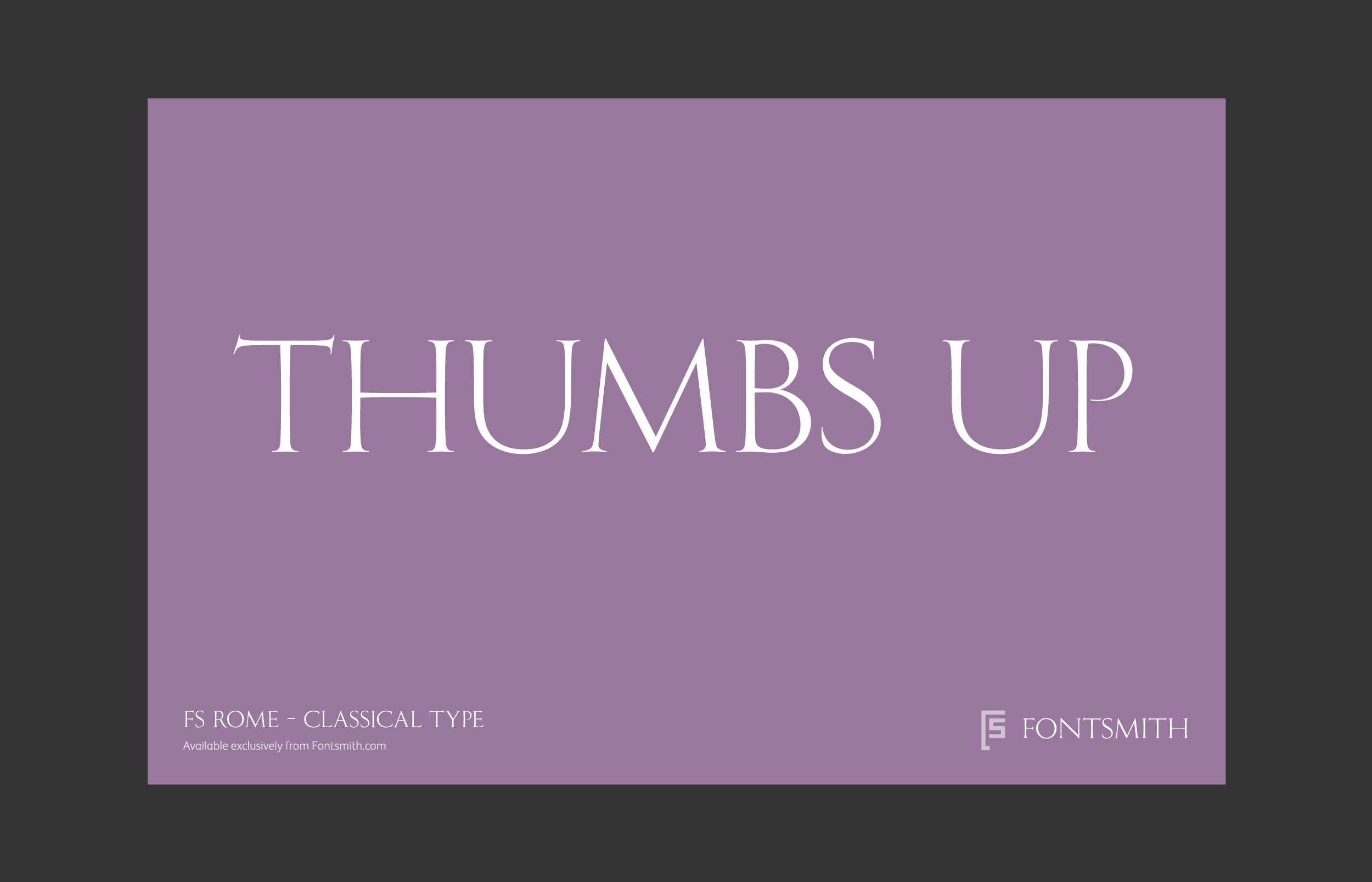
Personality types
Fontsmith are know for creating fonts with distinct human characteristics, named after the people or places that inspired them. To amplify this approach a simple concept was created that enables Fontsmith to communicate the character, personality and style of each font. This concept is called “personality types” – a simple, unique idea that allows each font to tell it's own story.

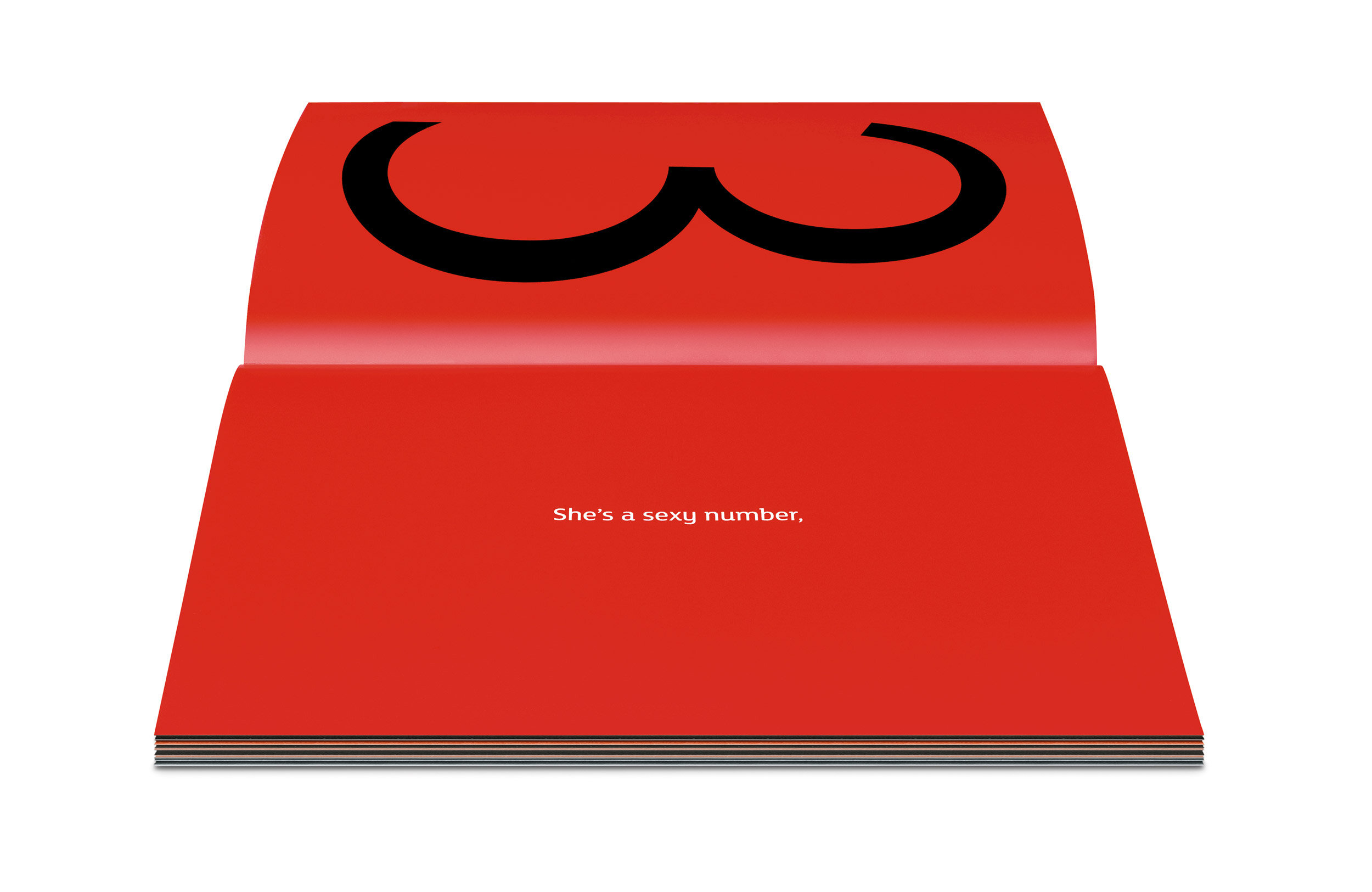
FS Lola launch
Inspired by The Kinks' song of the same name, FS Lola is a typeface that encapsulates the very best of male and female qualities – a transgender type. The brochure illustrates the lyrics to the song, words kindly reproduced with permission by Ray Davies.


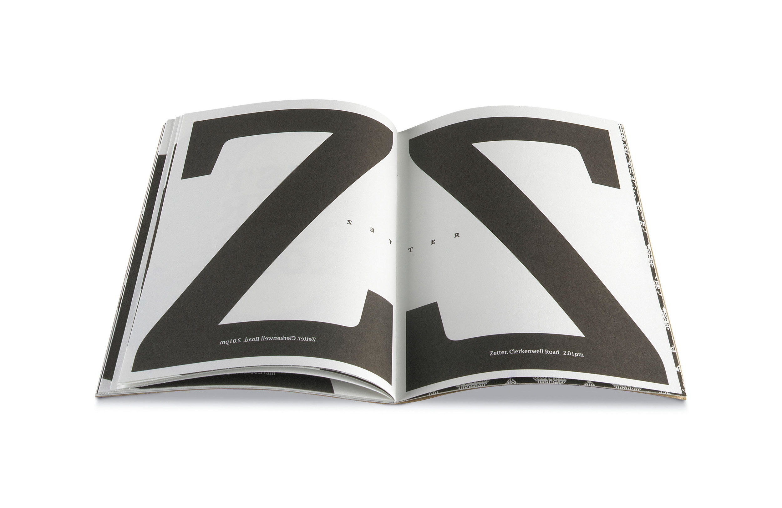
FS Clerkenwell launch
To celebrate the launch of FS Clerkenwell we created a limited edition brochure takes the reader on a typographic tour of the London district that gave the font its name.
This was the first Fontsmith type specimen and started a tradition of creating desirable printed mailers to raise awareness of the fonts and studio with designers around the world.


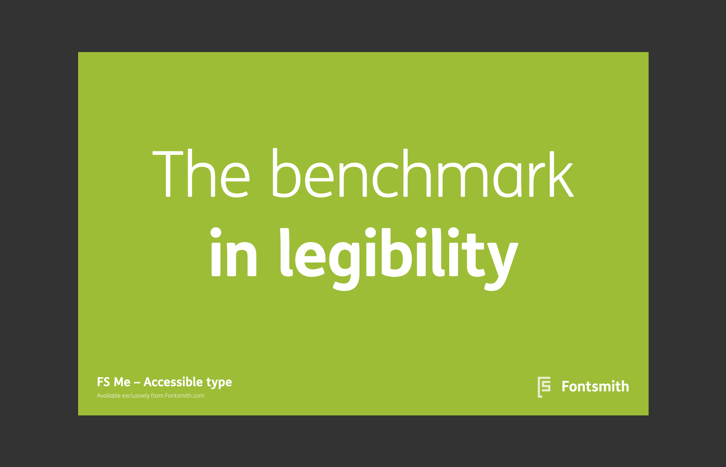
FS Me launch
FS Me is accessible type, designed to aid legibility. Researched and developed in conjunction with – and endorsed by – Mencap, the UK’s leading charity for those with a learning disability. To launch the font we published a brochure illustrating the accessibility credentials of FS Me and explaining "why" you need an accessible font.


“Ian’s ability to get into the mindset of our customers and approach the design of our identity from that perspective, was invaluable. Not only did he create a clever, beautiful and engaging identity, he advised on a marketing and advertising approach for a truly holistic brand identity. Ian has been a pleasure to work with over the years, quite simply I highly recommend using his services.”
— Jason Smith, Founder, Fontsmith