ALLDOQ brand identity
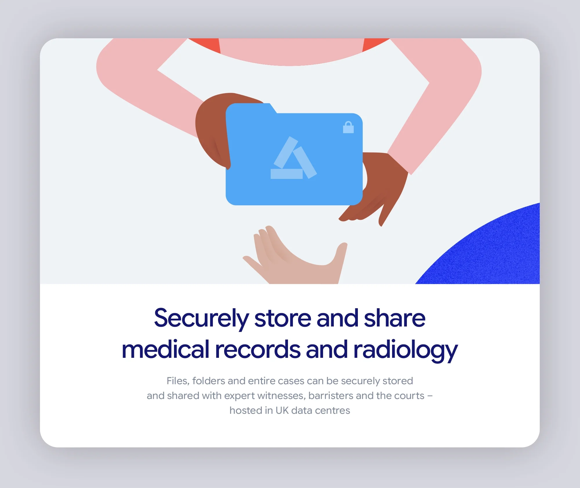
Brand identity program for a cloud-based platform that help legal professionals, agencies and expert witnesses to store, share and manage medical evidence with ease.

The ALLDOQ brand idea
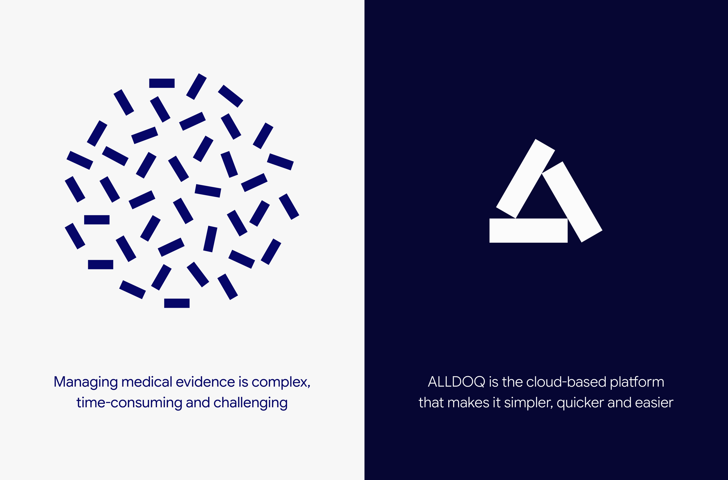
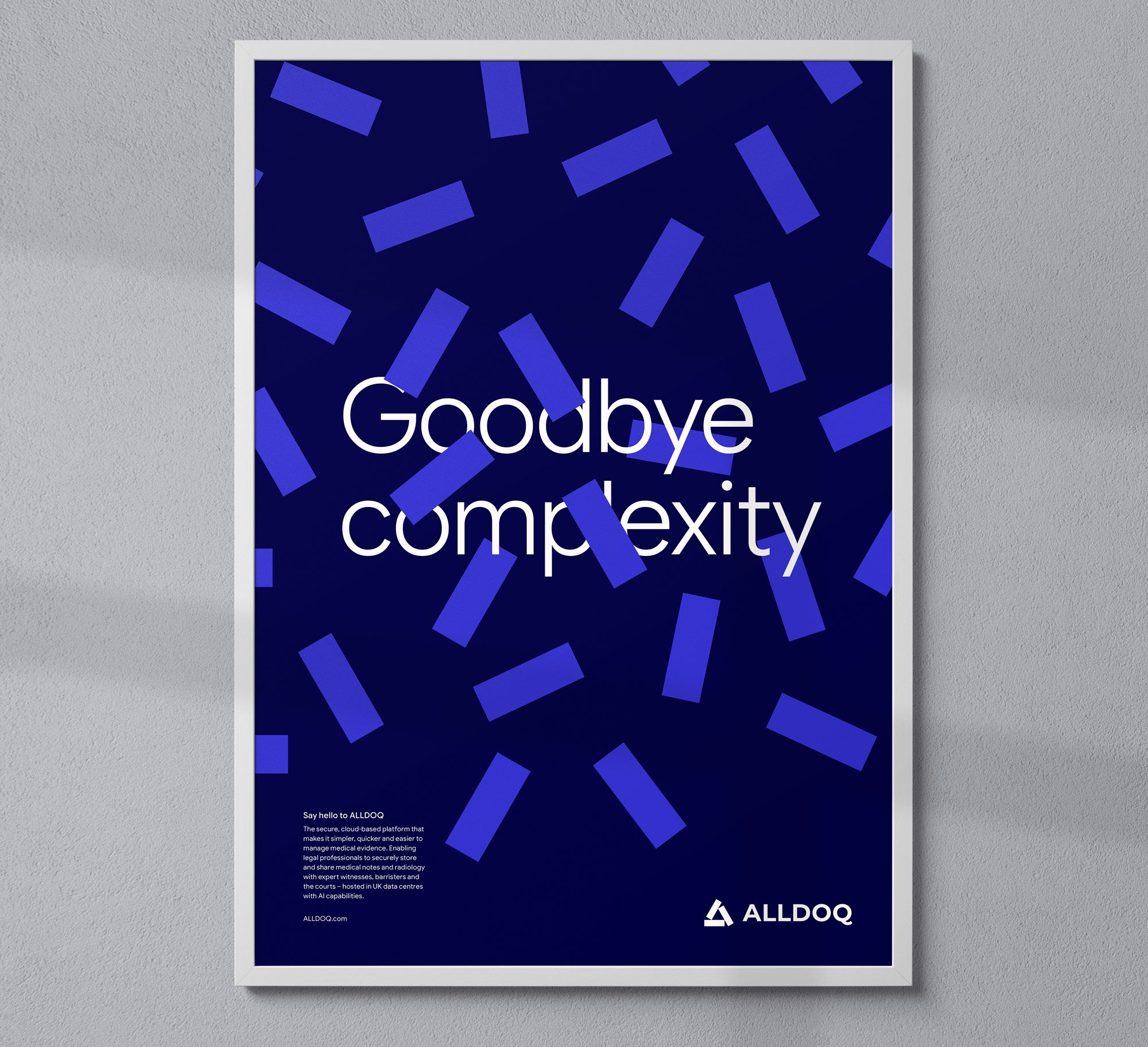
Making the complex simple
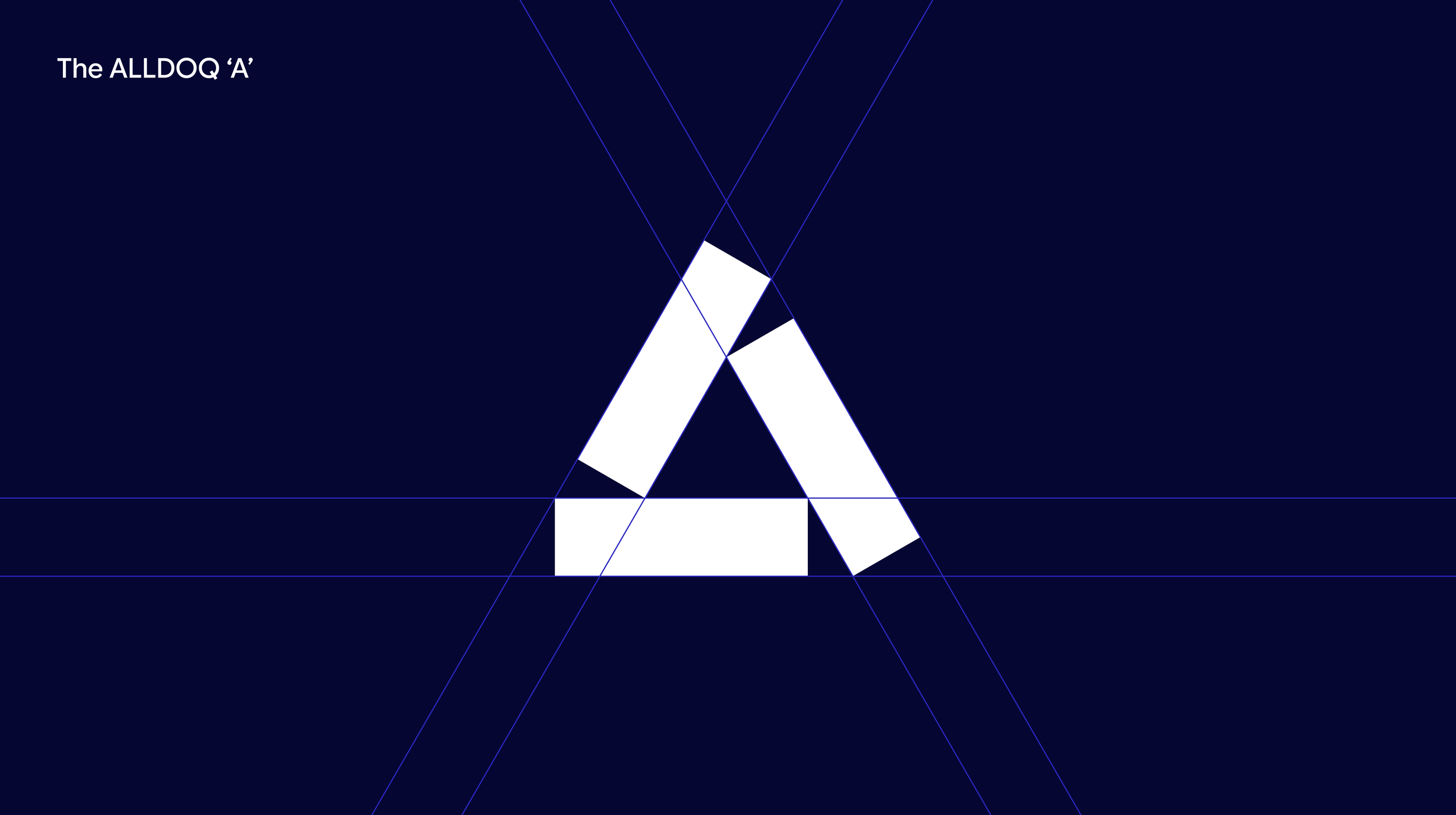
The three pillars of the Alldoq ‘A’ represent the three elements of the platform – store, share and manage – which align to symbolise users synchronising and securing all their files in one easy to use workspace.
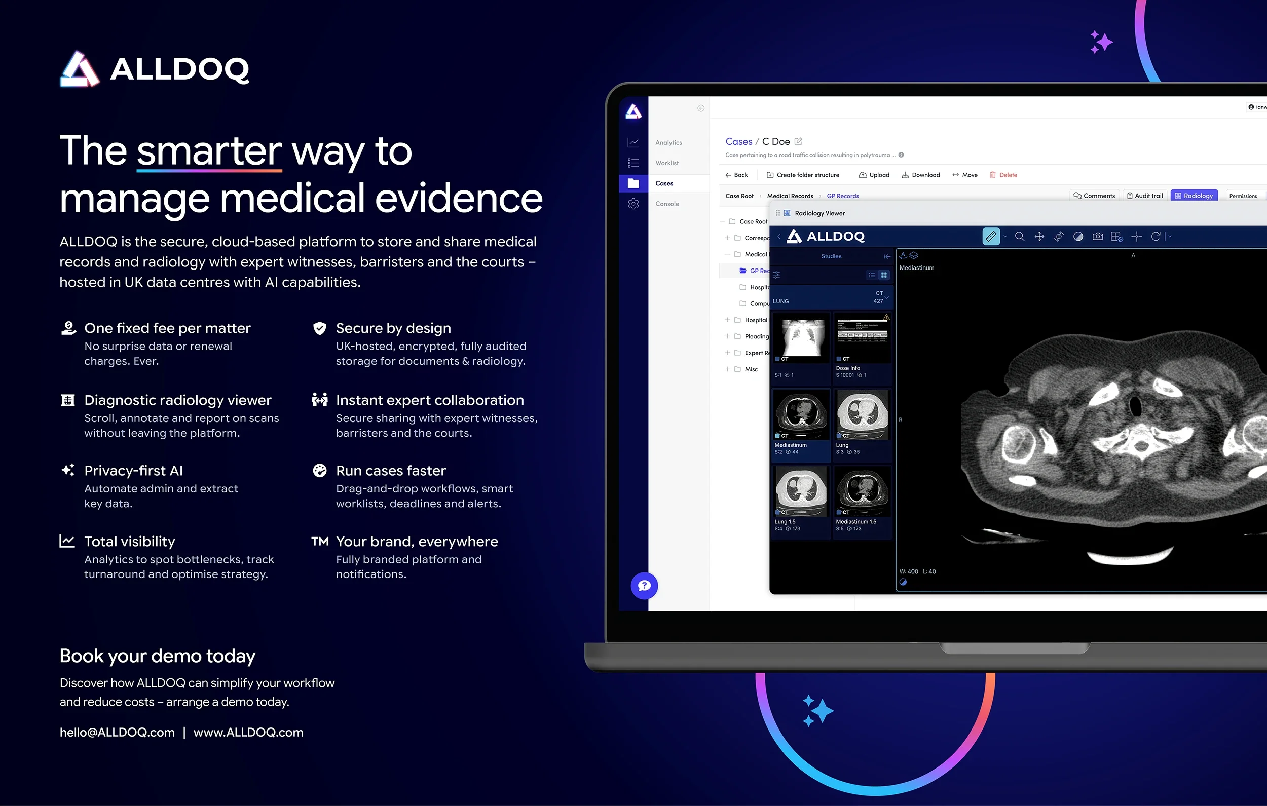

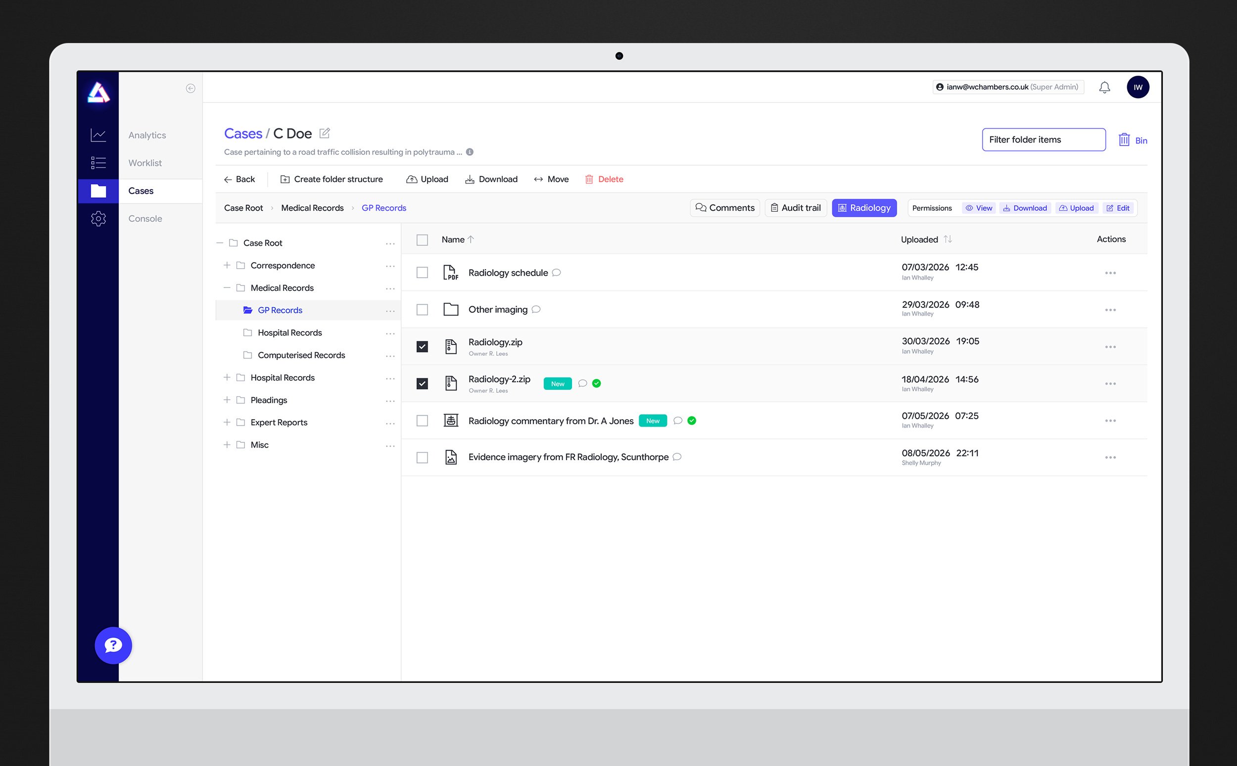
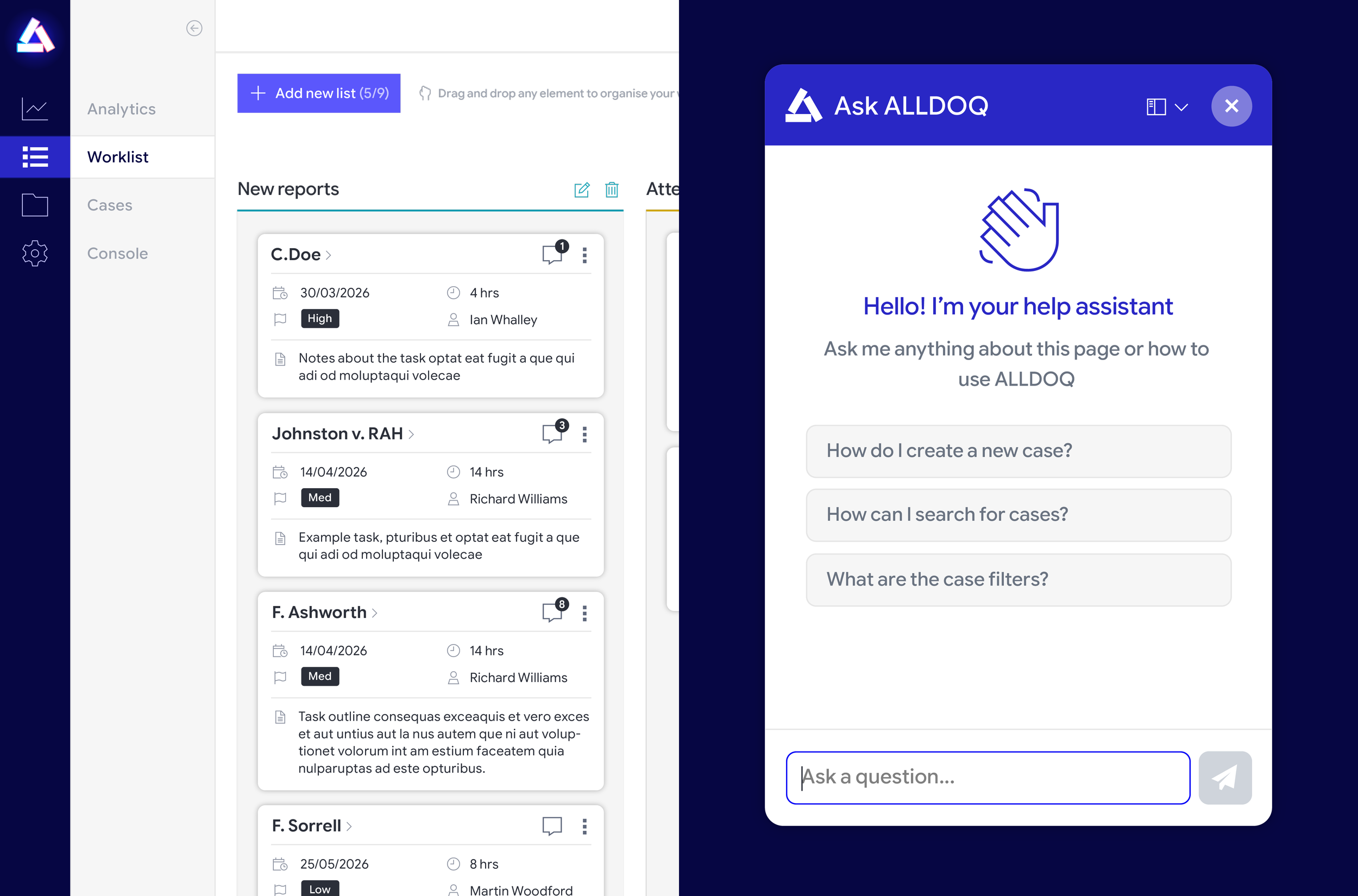
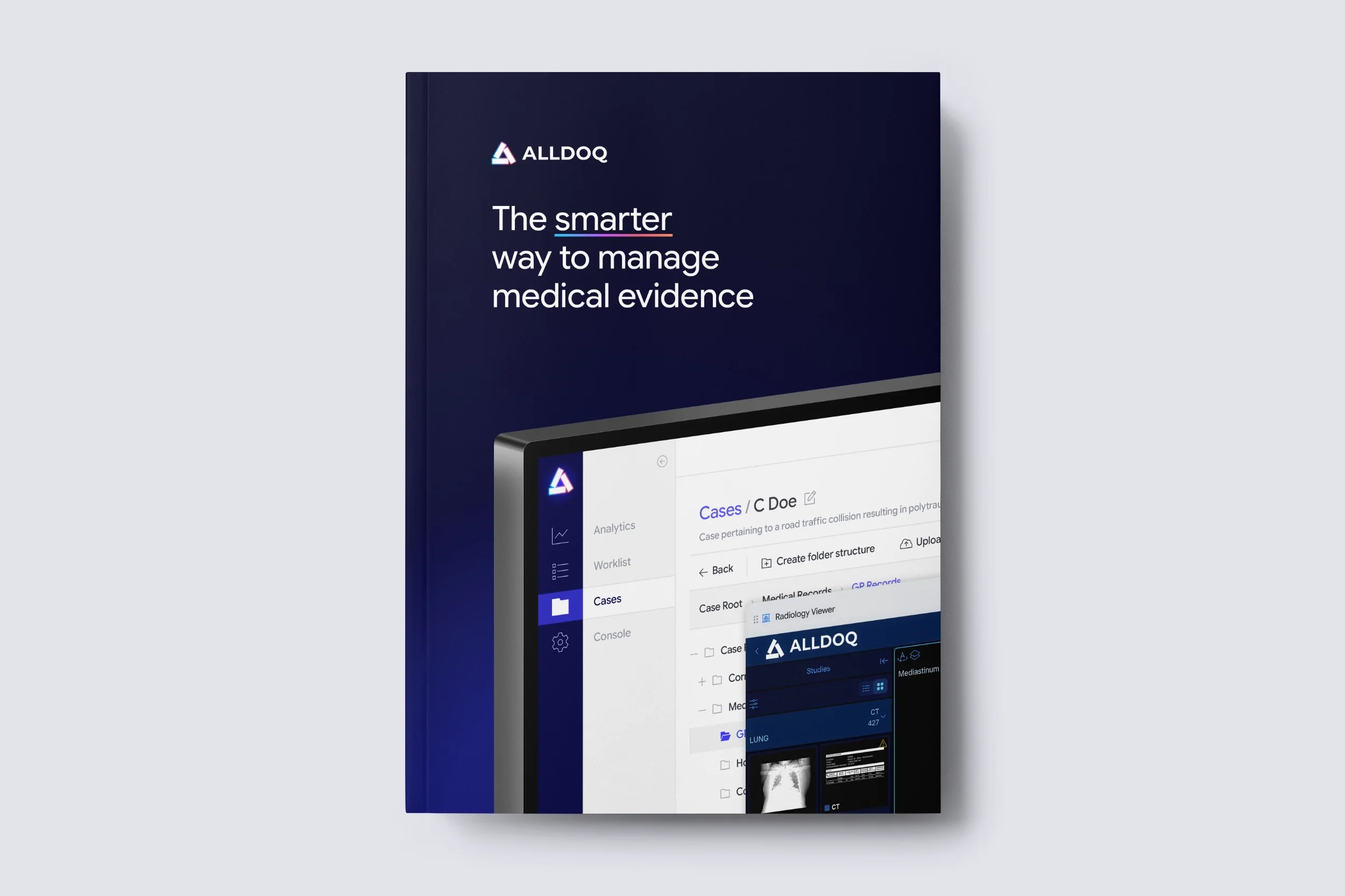
The user interface was designed to be simple and intuitive, everything was pared back to enable users to focus on getting work done.


With special thanks to Charles, Richard and Marcin at Alldoq
Creative direction & design by Ian Whalley
Brand strategy and naming by Sam McCollum & Fraser Norton
Website by Tom Exon